Friday, December 7, 2012

Annotated Bibliography


Annotated Bibliography
1. Livingston, Alan & Livingston, Isabella, The Thames & Hudson Dictionary of Graphic Design and Designers. London: Thames & Hudson, 2003.
This book gave provided me with a lot of useful information about The Industrial Revolution, however I would have liked to read more on Type and its significance during the time period in this book. This book made me think about what it would feel like to be working under such hard conditions for long hours in hot, sweaty factories. It however, did provide essential background information that we needed for our research.
2. Horn,Jeff, Reconceptualizing the Industrial Revolution. Cambridge, Mass: MIT Press, 2010.
This book is a collection of essays that offers many different perspectives on the Industrial Revolution and how is happened on a global scale. The information in this book is particularly useful for Tatianna and I for Project 1 on the history of type because this book compared significant industrial developments in countries ranging from China to Brazil. Although we did not really use information from many countries, it was useful to know and helped me to better understand the time period of our project. Understanding the innovations of the time period helped me to further understand why advertisements and fonts were the way they were.
3. Tholenaar, Jan, Type: A Visual History of Typefaces and Graphic Styles, Vol.I. London : Taschen, 2009.
This book was great, it has an array of fonts and graphic styles that have evolved over time. It offers an overview of typeface design, while also exploring some of the most beautiful fonts that have been used throughout the history of publishing. This book was useful for the wonderful images and their great quality as well as information about the evolution of type and when font categories were at their peaks.
4. Lupton, Ellen, Thinking with Type: A critical guide for designers,writers,editors, and students. New York, Princeton Architectural Press, 2004.
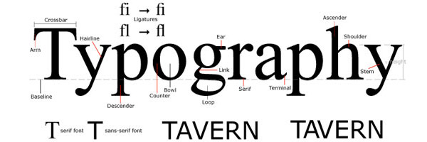
Although this book was used periodically throughout the semester, I really utilized it for Project 1. The typeface images were of great quality and description. I also really liked this book, because it is easy to read and comprehend due to its simplistic vocabulary and structure. It also served as a study guide for studying the anatomy of a letter for the Typography final.
5. Garfield, Simon, Just my type: a book about fonts. New York, Gotham Books, 2011.
I used this book for project 2 . It is about how font is shaped by the world we live in, and how we are surrounded by fonts everyday, whether that be on street signs, building, movie posters, books, and just about every product we buy. This book changed the way I now look at a printed word. When creating the four layouts needed for this project, I thought in dept about the placement and font of each word, since they are all so unique. Prior to taking Typography and reading this book, I would have not thought much about where and why I place my type, however now that I have read it, it makes me think more critically about type in my projects, work, and things that I see in everyday life, and their significance.
6. "Early Typographers : Design Is History." Early Typographers : Design Is History. N.p., n.d. Web.
 This online design journal discusses the years between the mid-15th century and the early 18th century, and how within that time came to be many changes and developments in the world of typography. For Project 1, Tati and I chose to discuss the time period of the Industrial Revolution, so this journal was perfect for that. It discussed the development of the printing press and how it influenced the development of full typefaces and their production rather the job-specific approach that most typography was created for. This journal discusses many type founders and significant developments that attributed to the Industrial Revolution.
7. "Typefoundry." Typefoundry. Typefounder, n.d. Web. 2012.
This blog called Typefoundry served as a great reference to me for Project 1 and 3! It is very detailed in regards to the historic time period as well as the type founder. I used this blog to read about type founders such as Baskerville, Garamond, and Didot. It was written in blog stlye, so it was less formal that books and research based websites.
8. Poynor, Rick. No More Rules: Graphic Design and Postmodernism. New Haven, CT: Yale UP, 2003. Print.
I looked into this book for Project two. It inspired me to work with text on a path and to not let my words and sentences be so structured. A spread of an artist books that was found in this book, titled, The Terminator line provided me with some creative ideas for beginning my layouts for Project 2.
9. Triggs, Teal. Type Design: Radical Innovations and Experimentation. New York: Harper Design International, 2003. Print.
This book helped me in learning how to work with negative space and appreciate it. I usually feel the need to fill every space with something, but this book had many simple, yet interesting examples of typographic posters that were not cluttered. This book helped me with project 2, because it served as inspiration to not create a cluttered layout.
10. White, Alex. Type in Use: Effective Typography for Electronic Publishing. New York: W.W. Norton, 1999. Print.

Type in Use explains the principles of designing pages with type and gives many examples from a plethora of current publications. This book served as more inspiration and helped me to brainstorm ideas for my projects in Typography.

Wednesday, December 5, 2012

Fonts & Feelings

After seeing all the final project from Project 3, I felt inspired to further my experimentation with type. I noticed how each type poster made me feel a certain way...not the content, but the font itself. There are so many small details that go into type. These posters could be aesthetically pleasing or not at all based on kearning,leading, font size, the strokes, brackets, the list goes on. Some posters that would normally seem cluttered to my eyes, were today seen from a new lense. I think over the course of this semester, I have truly come to appreciate small details and the look at the overall picture, rather than judging a "book by its cover". I now appreciate things that may be outside my normal clean cut look. Although I chose Didot as my typeface for my poster, I would have also liked to experiment with fonts that may not be so modern and clean cut. I really enjoyed this semester and am so grateful to have such a patient, kind, down to earth,and intelligent professor like Professor Asher. You go girl!!! If you arent inspirational..I dont know who is. But thank you for being you and serving as a positive light for many of us.

Tuesday, December 4, 2012

Water Color

I really, really want to learn on photoshop how to make watercolor splatters and letters. These words to come to spell Typography. I love that photoshop and Indesign have so many capabilities, the possibilities are endless. These letters really look like they were just watercolored with an old school paintbrush, watercolor, and water. The possibilities are endless on computer design programs, its great but also time consuming.

Serif & San- Serif


Since we just had the Typography Final, and we needed to know the anatomy of letters, I figured knowing the origin and significance of sans serif would be useful. Although the exact origin of serif is still debated, most theories seem to point back to the days of stone carvings.Some people suggest that serifs are a result of carvers chiseling over painted outlines of letters on stone, where the brush strokes would create the flares at the edge of letters. Serifs fonts are helpful in body paragraph text, and the individual serifs serve as a guide to help guide the eyes of readers to each character.
Sans-Serif is just the opposite, based on the french word sans, which means without.


Why learn Typography?

Typography knowledge can be applied to many things in life. If someone is working in a field of anything pertaining to Art it will come in handy. However, even if your furutre endvors do not include anything artsy, typography is useful in appreciating everyday things like billboard fonts. Learning to create your own typeface can truly change the message that you are trying to convey. Some letters flow with fluidity because the font is smooth, some fonts may be jagged and provide an edgy look and feel. In other words, Typography is simple enough to gibe us information, or even to stir our emotion. Typography simply has the power to change people's mindset, belief, and perception.

Wednesday, November 21, 2012

Didot is probably one of my favorite typefaces. Unfortunately, it isn't even offered on blogger :(. For project 3, I have chose Didot as my font to be the topic of my poster! I am extremely excited. So far, I have constructed the Eiffel Tower comprised of many different sizes and letters using the Didot font. I chose to make the Eiffel Tower, mainly because the creator, Firmin Didot originally cut the letters of Didot and cast them as type in Paris in 1784. The Eiffel Tower represents the origination of this beautiful font. Didot font takes inspiration from John Baskerville's experimentation with increasing stroke contrast and more condensed curvature. This font is also similar to faces developed by Giambattista Bodoni--- the various Bodoni variations. Didot is classified as serif due to its serifs at the end of its strokes. The strokes are almost my favorite detail of this font(these end serifs allow me to combine letters very nicely). I am excited to see where many, many hours in XARTS gets me in terms of the final project. I love that we finally  get to experiment with colors! YAY!

Tuesday, November 6, 2012

I really like this quote and the typeface used. The letters are very block and because there is hardly any leading in between the words..it makes the sentence seemed a little crammed. However, I think that because the font it so clean cut, it is visually appealing to the eye, even if the words are close together. The sentence definitely has fluidity, as a result of the clean cut typeface.

Wednesday, October 31, 2012


This font is called Mrs Eaves. Mrs Eaves is named after Sarah Eaves, the woman who became John Baskerville's wife. I absolutely love the typeface Baskerville, so obviously when Stacy showed me this serif font, I loved the femininity of it. It has the same classic, clean cut style of Baskerville, with a little bit of sweetness to it. The letters of this font each have a flowing swashlike tail. It is very elegant and I could see it being used for poems and fashion columns in the future. 

Tuesday, October 23, 2012


These cute pieces of jewelry are made my Brainbow and have many wooden pieces including camcorders, record players, cameras, that  all serve as pieces from the past. These adorable little nick nacks actually remind me of the wood type that was created during the Industrial Revolution and this type is classified as a San Serif font. Rather than using metal, this designer put a spin on jewelry and used wood to change it up. I really love the creativity. Build on!


Monday, October 15, 2012

Pizza has now become even more enticing..thanks to Dominos new packaging.


Dominos Pizza has just released a new item on their menu as well as new packaging to put the pan pizza into, that obviously surpasses the mundane pizza box that says Dominos in small red font. When I ordered this pizza, I was less than enthused about trying the new "pan pizza" that has resulted in so much hype in my friend group. After the pizza was eaten, I noticed the packing on the box, and it made me wish I did have a piece of that new menu item. There is just something significant and eye catching on the box that transcends the importance of the content. The font with the white outline is appealing and puts emphasis on what you're eating, as if you didn't already know. In addition to the prominent font used for pan in the center, the content circinling the center is also very interesting and has certain typefaces to emphasize its importance( such as never frozen is in a bigger font size than the rest, because Domino's probably wants that information to be read first.I also found the bottom of the box to be a bit comical and the fat faced font that reads " Hey"is very casual as if the pizza box has a voice. It was an interesting pizza experience that deemed to be entertaining.

Wednesday, October 3, 2012

Sorry I'm not sorry.


This instillation can be found in a french design studio Vegetable Identity, along with many other letter sculptures with vegetation in the positive space of these art pieces. The plants dont require water or light, because they are preserved with a sugar like product. I love the font used. The fluidity of the letters, as well as the spacing, radiates a mellow, yet foreign energy. The curvature of each letter is distinct and surprisingly does not cause the art piece to be cluttered or smashed together. The font looks a little like park avenue font, except for that this font is in cursive. Those who say "Pardon my french" are actually just alluding to the fact that they just said one or many curse words, and they will continue, since those words are obviously pertinent to their story! HAHA. At least that's my take on it, when I say " Pardon my french" im actually not sorry that im cursing. Should I be sorry? I definitely think that this typeface epitomizes this phrase and those who use it.


Let's be friends.


I found this on tumblr and loved it instantly. Not only does the word weird contain back words letters, but the each word is a different font. Talk about a PLETHORA OF FONTS in this picture! The negative space being blue is perfect to contrast the clean white and purple( positive space), which makes the typefaces stand out even more so. I also feel as though the typefaces are speaking to the viewer. YOU'RE is bold and denotes new and bold( as if meeting someone for the first time). The WEIRD symbolizes someone who is weird and breaks the norms, so it makes sense why the words are not all facing one way. Should be friends is in a typeface that is almost comfortable enough to look at and definitely gives off a more vibrant feel than the words above. Last, but not least the friends portion of this picture has a wonderful and bubbly typeface in addition to the index of friendship( which is the handshake). I can't help but smile when I see this picture, maybe because it's relatable? I am beginning to notice how pivotal typography is in all that we see; advertisements, commercials,websites, news papers, books, magazines,etc...
Type can change your feelings towards whatever it is written on and representing. This typeface is not crowded or too bold, it's simply cute. Now I have got to run, to go partake in some weird activities of course.


Tuesday, September 18, 2012

Cake anyone?


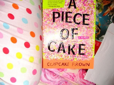
Filling my mind with ideas, knowledge, smelling the musty smell of the book , and flipping through the pages one after another as if I had nothing else to do, but be engrossed in my book. I love reading. With that said, the book in this picture titled A PIECE OF CAKE may look like a book about something along the lines of cake? Cake= happiness. However bright this book is, the content is extremely sad and completely unrelated to the sweet desert, cake. The spacing in between the text on the cover is not consistent( manually adjusted kerning) nor are they structured as if on a line( not all on the baseline). The words look like they were just thrown on there, and scratched up a little. This is actually quite interesting, because how the letters appear and their placement on the cover, symbolize what the content is. The distorted typeface and spacing relates to the author Cupcake Brown and her particularly troubled childhood and transition into adulthood. Instead of flowing nicely, the typeface is very jagged and gives the title an edgy vibe. Overall, I love how bold the font is and it definitely captured me attention at Barnes & Noble. Although this autobiography is anything but a piece of cake, its a great read!

Feeling cozy in my vibrantly colored pajamas, tea, this great book, and a soundly sleeping puppy. This is my piece of cake. 


Thursday, September 13, 2012


Good Afternoon,

This advertisement is probably the brightest thing outside on a typical foggy day like today. I just had to take a picture of this ad, simply because the colors are so aesthetically pleasing. I remember the days  when I would spend up to 5 hours a day on InDesign and Photoshop editing photos and learning to make the space inside the font a background picture rather just a color, so I appreciate the details of this typeface. I think this font is great. It's incredibly bold, not just because of the colors but due to its legibility. Its very clear and in all capital letters. It's crucial that typefaces are easy to read especially when they are on MUNI, people need to be able to capture the message of the advertisement in that short time that the bus is passing by. It is also interesting that many of the letters are filled with pictures of nature, since this advertisement was created to remind the public to take care of our parks. The kearning in between the letters also is important to the effectiveness of this advertisement, simply because if the letters were crammed together I would be less inclined to read what it said. Personally, I do not like when ads or words are  crammed, it just off a very cluttered vibe. Sometimes space is very  much necessary and makes it easier on the eyes. This typeface pops, due to the fact that the negative space is green and the positive space ( the font) is so vibrant. Overall, I was really drawn to this ad, and hope that MUNI has more ad's with color, because honestly black and white advertisements and fonts can become dull, especially on a foggy day.

Wednesday, September 5, 2012


This STOP- TOWAWAY is seen all around San Francisco to let people know it's not okay to park there. I was sitting at the bus stop this morning and took a look at this type and because of the space created in between the pieces of letters, it grabbed my attention. This almost typewriter print font gives off a negative vibe. Even if different words where placed here, the font is very formal and official looking. This font is informative and used quite frequently. It is the perfect font for street  numbers and important messages informing us of things such as--- TOWAWAY, so you won't park there and get your car towed.