Annotated Bibliography
1. Livingston, Alan & Livingston, Isabella, The
Thames & Hudson Dictionary of Graphic Design and Designers. London:
Thames & Hudson, 2003.
This book
gave provided me with a lot of useful information about The Industrial
Revolution, however I would have liked to read more on Type and its
significance during the time period in this book. This book made me think about
what it would feel like to be working under such hard conditions for long hours
in hot, sweaty factories. It however, did provide essential background
information that we needed for our research.
2. Horn,Jeff, Reconceptualizing
the Industrial Revolution. Cambridge, Mass: MIT Press, 2010.
This book is
a collection of essays that offers many different perspectives on the Industrial
Revolution and how is happened on a global scale. The information in this book
is particularly useful for Tatianna and I for Project 1 on the history of type
because this book compared significant industrial developments in countries
ranging from China to Brazil. Although we did not really use information from
many countries, it was useful to know and helped me to better understand the
time period of our project. Understanding the innovations of the time period
helped me to further understand why advertisements and fonts were the way they
were.
3. Tholenaar, Jan, Type: A Visual History of Typefaces
and Graphic Styles, Vol.I. London : Taschen, 2009.
This book was
great, it has an array of fonts and graphic styles that have evolved over time.
It offers an overview of typeface design, while also exploring some of the most
beautiful fonts that have been used throughout the history of publishing. This
book was useful for the wonderful images and their great quality as well as
information about the evolution of type and when font categories were at their
peaks.
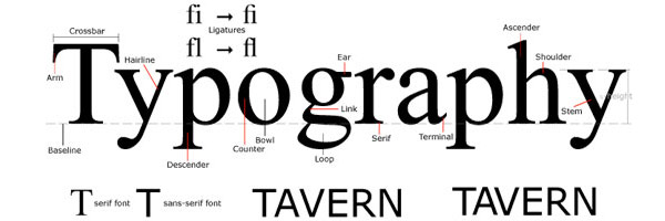
4. Lupton, Ellen, Thinking with Type: A critical guide for
designers,writers,editors, and students. New York, Princeton Architectural
Press, 2004.
Although this
book was used periodically throughout the semester, I really utilized it for
Project 1. The typeface images were of great quality and description. I also
really liked this book, because it is easy to read and comprehend due to its
simplistic vocabulary and structure. It also served as a study guide for
studying the anatomy of a letter for the Typography final.
5. Garfield, Simon, Just my type: a book about fonts.
New York, Gotham Books, 2011.
I used this
book for project 2 . It is about how font is shaped by the world we live in,
and how we are surrounded by fonts everyday, whether that be on street signs,
building, movie posters, books, and just about every product we buy. This book
changed the way I now look at a printed word. When creating the four layouts
needed for this project, I thought in dept about the placement and font of each
word, since they are all so unique. Prior to taking Typography and reading this
book, I would have not thought much about where and why I place my type,
however now that I have read it, it makes me think more critically about type
in my projects, work, and things that I see in everyday life, and their
significance.
6. "Early Typographers : Design Is History." Early Typographers : Design Is History.
N.p., n.d. Web.
This online design journal discusses the
years between the mid-15th century and the early 18th
century, and how within that time came to be many changes and developments in
the world of typography. For Project 1, Tati and I chose to discuss the time
period of the Industrial Revolution, so this journal was perfect for that. It
discussed the development of the printing press and how it influenced the
development of full typefaces and their production rather the job-specific
approach that most typography was created for. This journal discusses many type
founders and significant developments that attributed to the Industrial
Revolution.
7. "Typefoundry." Typefoundry. Typefounder, n.d. Web.
2012.
This blog
called Typefoundry served as a great reference to me for Project 1 and 3! It is
very detailed in regards to the historic time period as well as the type
founder. I used this blog to read about type founders such as Baskerville,
Garamond, and Didot. It was written in blog stlye, so it was less formal that
books and research based websites.
8. Poynor, Rick. No
More Rules: Graphic Design and Postmodernism. New Haven, CT: Yale UP, 2003.
Print.
I looked into
this book for Project two. It inspired me to work with text on a path and to
not let my words and sentences be so structured. A spread of an artist books
that was found in this book, titled, The Terminator line provided me with some
creative ideas for beginning my layouts for Project 2.
9. Triggs, Teal. Type
Design: Radical Innovations and Experimentation. New York: Harper Design
International, 2003. Print.
This book
helped me in learning how to work with negative space and appreciate it. I
usually feel the need to fill every space with something, but this book had
many simple, yet interesting examples of typographic posters that were not
cluttered. This book helped me with project 2, because it served as inspiration
to not create a cluttered layout.
10. White,
Alex. Type in Use:
Effective Typography for Electronic Publishing. New York: W.W. Norton, 1999. Print.
Type in Use explains the principles of designing pages with
type and gives many examples from a plethora of current publications. This book
served as more inspiration and helped me to brainstorm ideas for my projects in
Typography.